Designing for
Interaction
- WEEK 1 -
Introduction to UX, UI
1. UX
User Experience - UX is how the 'USER' interacts with particular product, system or service. Overall, it includes person's perseption, utility and efficiency. The main goal is to meet the persons criteria.
It is a term that covers the 'END-USER' interaction with company it's web presence, services, communication channels and products.
On larger scale, UX is vital as its main goal is to fulfill all the needs of the USER and to provide positive experiences that will keep the clients loyal and ingaged to a product, service, etc.
2. End-User
It is a term given to the actual people who use a particular website, service etc. They are the one who interface/ use a business products/services etc.
3. The main parts of UX
3.1 Visual Design
- Good visual design, without delays and chaotic struction makes the customers experience good.
3.2 Functionality
- It is part with the Visual Design. if it functions and has good design it is a big plus. The functionality are the actual buttons on and applicaiton, service, game etc.
3.3 Usability
- It is how accessible and available a mobile device is on or out of browser, or is a game Steam only or PC only and etc.
3.4 Typography
- It might be linked to the visual design but it is actually how you can display a text on the screen.
3.5 UI
- What exactly does the visual elements are exposed to the customer.
3.6 Content Strategy
- It is how well you advertise you product, do you do daily, weekly or monthly discounts, how exactly you keep your customers loyal to your product.
3.7 USER
- The most central person fro who we are designing and interaction.
WEEKLY BLOG TOPIC #1
HUD Analysis
Game: Destiny

1. Introduction to the game and HUD
1.1 Game
An online-only multiplayer firs-person shooter game, Destiny is developed by ‘Bungie’ and previously published by ‘Activision’. It has been released worldwide on 9th of September 2014 for the Consoles - PlayStation (3,4), Xbox (360, One). The game has a featured multiplayer ‘’shared-world’’ environment with role-played elements.
1.2 Overall Story
The player (you) takes part as a Guardian who have the task to protect the Earth’s last safe city using a power called Light. It has to protect the world form the ‘Aliens’ and to travel with completing tasks and to destroy the aliens in the game’s universe.
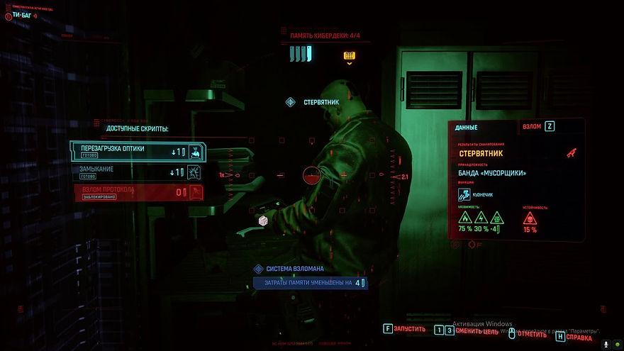
1.3 HUD
The game itself showed high RPG systems and a hardcore Gameplay only for the good PCs for the time while it was published. That kind of games have intense group selectable objects because it is quicker to navigate through the HUD system with a mouse.
.jpg)
The free cursor helps the players to navigate easy and without navigating things one by one. About selecting an item, they have created a smart UI elements such as slowing down the cursor acceleration when you are hovering directly over an element and again it speeds up so it is possible for you to quickly highlight something at the other part of the screen without overshooting by accident or to slowly drag a high friction cursor to an item you want to select.

The UI has screen counter-scrolling when the cursor is being moved around. That helps for making it quicker to access items and allows the player for more real estate to be displayed on the screens. When a player wants to see a particular information or overall to load something, it only loads that part of the information which helps a lot of the world to be fast without slowing the gameplay and it is perfect for a multi-player game.
Part of the UX is the Typology.
Instead of Sci-fi text which will be preferred by many game users, Destiny has clear Swiss Typology and ancient cartography which provides clarity for the user. This helps the player to be guided while playing the game and even there are large 3D models and parts of the concept of the game itself, the player can be easy focused on the text appearing on the screen.
2. Various Elements of the HUD

As you start playing the game, you will be able to choose your class as a player, you can join team or create one. As you can see the colours are not bright, it has so many variations, but the overall aesthetic is dark and thematic for a Sci-fi shooter game which takes place in the Cosmos. It is easy to choose – materials, consumables, also to choose missions as a only-player and etc. Everything has one thematic but in a variety of colours which are not really blind and at the same time not dark, so people with colour problems will be able to identify the items.

It is available to choose between Items such as Armours, Weapons and General stuff, so it is easy to navigate though the UI and to understand the meaning of every window. The typology is perfect for reading, not too small or too big, you can see the general text and the undertext.

When you complete a mission, it will be easy for you to see your XP, REPUTATIUON and etc. As it will all appear at the end of completing. You can see the image above, how the overall aesthetic is sci-fi, good typology and clear explained details about your character in the game.

When you play in a team, it is easy to see the beginning of it and with which other team you will be able to interact in the game, the colours again have aesthetic, and it is pretty clear whether you win or lost the battle.


The actual HUD while gameplay
While you are playing, you will see only your both hands (first-person), you will be able to see the environment which is loading in front of you. You are holding your weapon (gun etc.), you can point the weapon and have a sight which zooms in to see the object you are about to shoot. You can reload your weapon. On your left bottom you can see the weapon you are using. There is an arrow which points the direction. It shows you do you have patrons, grenades and etc. Usually, they are in green colour.
.png)
.png)
.png)
You can see yourself third person while you are driving a vehicle and how fast you are speeding. On your left it shows you a typology (text) in which territory you are.
Overall, the only dislike is that because of the clear UI while gameplay, the player can be a little bit lost because there is no typology of what is your HP and etc., it is only Visual Performance.
3. Critical Analysing
Menu Layout and Presentation
In Destiny, there are a lot more things than only fighting and achieving. The main part of this game consists the UI Layout and all the main functionality when you are not playing with your weapons. The layer of abstraction around the player as he is a Guardian, a lot of menus in this master game.
The menu has a lot of traditional layout systems and a lot of buttons, boxes that the player navigate while using the UI. But one of the things that need developing in my opinion are the free cursor because it will help the player while playing on PC but with controllers with console it comes to be more difficult.
After time, the creators of the game worked on the game UI Layout. They have replaced a lot of the parts of the UI.
Overall, the menu Layout now is consistent and clear, people can easily read all the data putted in it. It works fluent and the Map Layout in the game are readable, with good aesthetic and the functionality is fascinating, fast and people can have good experience and goodlooking layout at the same time.
The game has changed a lot since it’s first releasing, the creators have been working a lot till create something that is easy understandable and at the same time enough complex to be compatible for Destiny.

Fortnite UX Designer Breaks Down Fortnite's UI / UX | Ars Technica
Summarising the main points
1.The HUD
Instead of putting a lot of information all around, they reduced the memory load because in ‘Fortnite’, there are a lot of small things and this helps the player to understand naturally what is happening.
Examples:
1. Weapons - In the Icons there are smaller icons to show what type of ammunition the weapon has, instead of trying to memorise.
They are showing the control of the action. The HUD is showing key’s that the player has to press, there is always guidance.
Overall, this helps the player to play naturally, instead of forcing himself to memorise data.
2. Health -The player will see two types of colour – green or red. The green colour shows him that it has good health, the red that he does not.
The colour helps you to understand visually better than memorising numbers.
3. Building - The player sees all the types of material for building. It also shows how much they have left.
4.Harvesting – When you harvest, and it show you that there is a weak point in the structure and on this point, you can harvest faster to break it. Again, helps you. The music also helps for entertaining.
All these things help for the natural and intuitive gameplay, and the good UX.
2.Signs and Feedback
They are very important for the player and needs to be polished because they show the player what is going on.
Example:
-
Building a wall – It shows red on the area where you cannot build, it shows green where you can build. Also, for not enough material – there is also a feedback which show you. There are also signs which shows you where you can swap material and etc.
Overall, only though signs and feedback the player will be able to understand what to do.
3.Game Feel
Not only the usability but the engaging gameplay is going to make the player feel excitement and to play more and more.
Using great Art style and clever interaction design shows a lot about the game. The interactions interacting with you, are making you feel the game.
Example – For example, when you break the piñata, she talks to you while the cards are showing up, the gaze of it interacts visually with you and etc. and etc.
Making it fun to interact with specific System or Feature.
4.Onboarding
Teaching the player on the mechanics and the systems in the interaction, is important. Making the player to like the tutorial without knowing it is a tutorial. You have put the player into situation which is meaningful for them to learn without truing to show them we are teaching them.
Example: In the beginning of the gameplay, the player is learning that the walls can actually protect him from the Husks. To they can build walls and protect themselves.
After that, the gameplay shows you can build stairs and that is how you learn to built things one by one.
Overall, though gameplay they are teaching the player the first steps of building.
5.Enemy Health Bars
In the UI, they want to be assured that the player understands quickly what to do. Though colours and visualising as the different bar’s colours, different elements that shows things like – when you will die, where is dangerous, where is not dangerous. Though the simplest colours as green, yellow, orange, red they can show the player.
6.The loading Screen
The loading screens are showing what is loading and when to wait. They used the loading screen to tell the player something important and this way to interact with him and to full his time in waiting. You have to keep them short.
7.Accessibility
It is very important because a game needs to be played by all sorts of player, even with people with disabilities. That is why, the game has colour-blind mode, a map layout of the controllers and etc. They use colour and shape.
8.Searchable objects
Whenever the player gets closed to an object, a window will popup to show them what key you need to press to search the object. That is again because of the memorising.
9.Pinning Functionality
Again, not having to memorise. It will pin different things while you are in a game and that will stay with you and will show you what you want, for example, what ingredient you need. This is a functional affordance.
If is a functionality that developers put in there to help players accomplish their goals.
Reference List:
Ars Technica (2018) Fortnite UX Designer Breaks Down Fortnite's UI / UX | Ars Technica
-
13 September. Available at: https://www.youtube.com/watch?v=4DE_4HUX94E (Accessed:22.02.2021).
- WEEK 2 -
Mental Models and Implementation Models
Overview
We can use insights for the product through psychology.
Psychology is needed for discovering what people truly need for crafting and building design, how to improve and solve problems.
For soluting problems we need to research first. There are two ways of doing that. Creating analysis and diagrams with research based data or imformation purely coming from an informant (user).
Mental Model
Several theories psychological and etc are explaining what are the concepts of the mental model. Mental model is what the user believes about the system, at hand. Users base their predictions for a product such as game,software or platform based on their mental models build by previous symilar products and plant future actions based on that.
Each user has personality and it has built mental model in their mind in different way that one another for a particular product. So softwares which provide customizing user interface are on the right path, this way the user can control and learn faster, it is the same with games.
User Flow
A visual representation, written out or created digitally of the each avenues that can be taken using a website or an app. The chart starts from the beggining to the end. Visual communication tools.
1. Flow Chart - Helps the programmars and designers to know how many windows and screens are needed.
2. Task Flow - It focuses on how the users go through the olatform while operating a specific task.
3. WIRE Flow - greyboxing.
4. User Flow - It focuses on the way your target audience will react or interract with the product.
WEEKLY BLOG TOPIC #2
CREATING WIREFRAME FOR PROJECT
- GAME -

TED Talk – Mihaly Csikszentmihalyi – Flow – 2004
Summarising the main points
1. In a survey in US since 1996 people say that their life is very happy. That has not changed at all, the income has increased and improved because the inflation the budget has doubled and tripled. This means that even a few thousand dollars above the minimum income make people materialistically happy for their life. In a research for this it is said that materialism cannot buy happiness.
Mihaly Cskszentmihalyi’s research and he himself tries to understand where people in their everyday life are feeling really happy and can be a person happy at all. He first began to look at the creative people such as artist, musicians and etc., he tried to understand what made them feel it was worth to spend their life doing things about themselves not about fortune or fame.
2. People start to reference happiness to extasy. And the mental statement about it shows it is when you are not doing your ordinary or everyday routines. So, extasy is stepping into alternative reality and when we think about this, about every ancient country which existed we know about their Ecstasies not their ordinary everyday life, only the good part. The remains of civilisations where men went to experience life – the happiness of not doing ordinary life and be concentrated out of the world.
So, why he chooses the creative people. For example, the man that Mihaly is talking needs only paper and his imagination. When he starts to create new reality, that is moment of ecstasy. His experience made him feel like he almost did not exist.
But Mihaly says that our nervous system cannot process more than 110 bits of information per second and in order to hear more than two people and understand them, you will need more energy and concentration. So, it is completely engaging process of creating and completing something new. So, when he is creating, his identity and body disappears, the consciousness. It is said that you cannot create anything with less than ten years of practising, technical motions and etc.
3. Flow in Poetry:
So, the person who works with poetry describes that be in this state of mind is like opening a door that floats up in the sky.
Flow in Figure Skating:
You do not think about anything, you become one with the music.
So, having a passion will lead you to the flow which is the balance between everything. As a person needs to dedicate their heart and love their job to succeed, to help others and to be truly happy while doing it.
When you are in the flow, your actions becoming worth doing for it is own sake.
4. The Research:
A research where people participated and wrote their feelings and presence moment, the researchers wanted to track them when they are in the flow. So the flow channel is when you are doing what you really like to do, everything.
Control is alco a good place to be because you feel comfortable but not really exited or challenging. So, if a person wants to enter the control flow it needs to have more challenges. There are a lot of different Flows but for each person is different.
5.
How to put more and more of the flow in our everyday life and that is the thing needed to be understood.
Reference List:
A. R. (2015) TED Talk – Mihaly Csikszentmihalyi – Flow – 2004
4 October. Available at: https://www.youtube.com/watch?v=I_u-Eh3h7Mo (Accessed:01.03.2021).
- WEEK 3 -
Psychology of User Experience
1. Interaction Design Model
1. Context - the platform the User is using
2. Goals - The needs and desires of the Usear about the product from start to finish.
3. Behavior - How people are interacting with the product.
4. Percieve - The first step is to percieve that the opportunity to interact exists.
5. Prediction - The best part of the goal.
6. Interacting
7. Feedback - user's feedback
8. Learn and Practise
9. Remember - mental model.
2. Sensation and Perseption:
Interaction focuses on:
● Vision
● Hearing
● Touch
● Proprioception
1. Perseption - The prosses becoming aware of something through senses.
2. Sensing - familiar toughts
3. Proprioseption - A phenomenon where we already know the movement and etc.
1. VISION
Every person persieves colour in a different way.
2. Designing for Colour Deficiency
Use multiple signals, important colours to be differentiated.
3. CHROMOSTEREOPSIS
Do not combine colours which are very different from each other, learn colour theory.
4. HEARING
Visual messages + signals, music etc.
5. TOUCH
Create mechanical sense where being triggered by movement, or pressure on sensory.
6. Haptic Perception
Active exploring using multiple things - size, weight, contour etc.
Gestalt Theory
1. Lay of Figure-Ground
The closer the boject - the more define it is.
2. Lay of Simplicity
To interpred complex objects in the simplest way possible.
3. Law of Proximity
If things look in the same way, they are part of one other.
4. Law of Common Fate
Objects moving together - belong together.
Gestalt Laws can help guiding the designers to make their desicions better.
Gestalt - The Parts and the Whole - Extra Credits
Summarising the main points
The world is chaos full of symbols and signs and our brain needs everything to be in order to understand. The brain understands the things not as each different component but as a whole which is different from the ordinary pieces.
The Gestalt Theory is also in Game Design.
We already have a mental model about everything that we have learned. We don’t see a dog as different components to know it is a dog, for example. The brain takes in all the visual information and combines is to – That is a dog. We are consciously aware of things before starting to see difference between them.
The design is about conveying information.
By understanding the system, we can create things easy for the player and make them instantly understand and get things, without explaining everything.
What helps us for a gestalt or form a group of things as a whole – The lay of proximity. For example, if we see 3 dogs on the street, the brain does not make a group of the small parts of the dogs, but the dogs as objects – mesh.
Second is the Lay of Similarity – we also tempt to group things which are similar together, that is why often enemies in a game are similar and often in similar or same colour.
Third, the Lay of Closure – our brain auto fills the missing things and can create shapes and forms of its mental models.
Lay of common fate – the lay of directionality – when the brain is dealing with motion, our brain sees things as a group which are moving in the same direction.
Lay of Symmetry – the brain combines elements as one group which are symmetrical.
Gestalt groupings can help us to find friends in the game, navigate space or even parcel inventory etc. The idea of Gestalt of pulling together information into a larger whole can be used anywhere where is a visual information – UI , enemy patterns or puzzle design.
Reference List:
Extra Credits (2018) Gestalt - The Parts and the Whole - Extra Credits
15 August. Available at: https://www.youtube.com/watch?v=c1qdyszaeTU&feature=emb_title (Accessed:10.03.2021).
WEEKLY TOPIC #3
Project Proposal Document - Group 2
Ideas Document:
Proposal Document:
- WEEK 4 -
Feedback and Signage
USER PERSONAS are the users which will interact and give feedback about a sertain product. They are the people who will use the product or want from you to create for them. We need to research about them, about environment, their personality, usual time when they will use the pproduct and etc.
The best designs emerge when we understand the bigger picture in a broader context over time
Don’t conflate urgency with importance - they are not the same
People are less likely to interact if they do not perceive the opportunity to interact, even if they need or want to interact
WEEKLY TOPIC #4
PERSONA MODEL
CREATED BY GROUP 2
About our weekly blog topic, my group and I created a USER Persona which will be the typical stereotype of a person who will use our Product. Here I can share a bit more details about our concept Idea for a product. It is music oriented product which is a third person game which will be developed by our team in Unity Engine. People who have strong connection with the music itself and have strong feelings about sound and etc will be, as well, oriented to our product and because of conditions such as time and energy, the typical age between 14 - 17 will be the most popular.
So, the User Persona is available here:

- WEEK 5 -
Interaction Framework
Five Dimentions of IXD by Gillian Crampton Smith
So, those five dimentions of the IXD are very important in the overall content of today's topic. They are words, visual representations, physical objects or space, time and behaviour. Why?
Because the content should be easy understandable and written effectively (communication through words. The Diagrams, Illustrations and typography styles are all visual representations with which we communicate and show too.
The ohysical hardwares (smartphone, keyboard or mouse and etc.) are needed for using the product.
The time during wihch people interact with it and show progress is important.
And at the end the behaviour of the people towards the product.
2. Design Thinking
A designers thinking is different because he or she need to understand people and the problems that might have occur, all the challenges assumptions and to generates solutions in a creative way. Also they need to observe and empathise with the users, to understand the thing from their point of view, to explore different things and create too. After building the product to deliver it, and after receiving feedback to improve it.
The designer itself needs to understand people's needs and this way to define it's products purpose. To be sure that the product is easy to use and understandable, to interact with people and to be easy to remember. It takes a lot of time and efford. Which is the UX -> It takes a team effort.
3. Levels of Design
3.1 Structure
The oeverall organisation and architecture or the product, all the pieces and how they connect to eachg other.
The structure has three levels - Product, Screen and Component.
1. Product - all the things inside it, special offers and sales, browsing, items, payment methods and etc.
2. Screen - Which belongs on which page, where should it appear and al lthe communication tools.
3. Component - the content and interactivity of the elemnts on the screen.
4. Multi-channel Ecosystem
Many projects and services are used in conjunction with others and this means how the product fit into a larger ecosystem, the paths and states.
We also have Interface, appearance and behaviour.
WEEKLY TOPIC #5
Designing for the User
CREATED BY GROUP 2
Summary of ''Understanding Color''
1.Colors
Colours can help the viewer to be guided through and focus on what is important. It helps changing the mood in a scene, tell a story or just to show important things inside a scene. If the colour is being used wrong, it can make the viewer to feel lost or even irritated. It is very important to start using colours in the right way or then they can break your scene.
In terms of photorealism, it can show if an image is fake or real and getting colours right is hard.
Throughout the day we see billions of colours, but it is hard to try and study them even memorise all of them. As children, we learn about the colours in the simplest way possible. But using only the main colour in every aspect is not right.
2.Saturation and Value
That is why we need Saturation (Intensity of the colour) and Value (brightness or darkness of the colour). It is impressive how only using one colour and working with saturation and value of the colour you can create so many different shapes and etc. Highly saturation makes things looks fake and it is not a good thing used in the CGI world because it is important in an image because our eyes need to rest.
The brightness of the saturation can be used in a good way too, it can be used as a composition element showing important thing in a scene. The vibrant bright colours show happiness, but the sadness is expressed through very desaturated tones. It is used also in compositions to show different components of a scene.
Overall, use the saturation and value to guide the viewer, to tell a story, change a mood and do not overdo it.
3.Colour Harmonies
Also known as colour scheme and complementary harmonies.
3.1Monochromatic
It involves only one colour. Best for single subjects and it is also for very atmospheric effect.
3.2Analogous
Colours that adjacent on wheel and it is easy on the eyes. It is peaceful and creates comfortable mood in a scene. Also, seen a lot in the nature, the trees, and the sky, etc.
3.3Triadic
It is one of the hardest, equally distant colours on wheel. It is hard to pull off and it is best for cartoon or surreal scenes.
3.4Complementary
It uses the opposing colours on a wheel and also very popular. It is naturally pleasing to the eye and it should be used the weaker colour so one colour predominantly.
3.5Split Complementary
Similar to complimentary but we take one individual and split it, it allows to use three colours and helps for the creative freedom.
3.6Tetradic, double complementary
Two pairs of opposing colours and it is best for foreground or background. And never use 25% of each colour, all to be individual.
- WEEK 6 -
Mobile and Tangible Devices
1. Perceptual Constancy Environmental conditions change all around us, yet we still perceive the world and the things in it with great consistency
Overall, for Perceptual Consistancy we need to focus on the shape, lighness, colour, distances, size, location, timbre and sound. Because a lot of problems can occur while we are creating a product which is communicating with people.
2. Microinteractions Microinteractions are the small nuanced reactions of a product that provide information and feedback
We need triggers for signaling different things inside the software or product, also the rules which are the conditions under which define what will happen. Feedback is always the best way which verifies that the person is interacting. And the loops and modes in the particular product helps for repeating different features or part of the product's features turns in different modes to help giving you a certain information.
3. Motion
About motion, it helps the user to draw its attention to a specific thing, but can distract easy which is bad. That is why we need to use it with purpose.
4. Haptics
We perceive and manipulate objects using our senses of touch and proprioception and toich provides information about the external environment.
Different types can be used suck as vibration, force and texture.
WEEKLY TOPIC #6
Development Diary
First of all, let me introduce me and my team's idea. We are group 2 and decided to create a product which is a 3rd person adventurous game based on physical puzzles only using Unity Engine.
The idea overall is that you control a character which will go inside two different levels and will look for physical objects which contain part of a song and each level has one song, at the end of each level, all the pieces will combine together and the user will be able to hear the whole song.
We are four people different oriented in our group and all of us work on different tasks and this way we can be an affective team. As you alreadyu know the User Persona and Designing for the User, now you will have the chance to see some documents and concepts.
First, we started with an Ideas Document which all four of us filled and this way it was better for us to understand which idea will contibute and how all the different views and imaginations will combine together. We all are fully aware that creating a product as a game is a hard beggining but at least we will be able to finish the first DEMO of our game and explain all the features in it.
1. The Ideas Document:
We also have a Discord Server where we can communicate. About all the Documents and important work we have OneDrive.
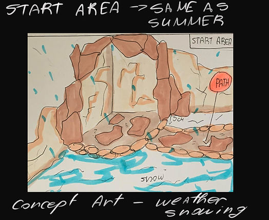
After talking with our lecturers, we decided to start thinking about concepts and ideas for all the levels, so I created basic concept drawings of the Level Layouts and etc. The first idea for creating the game was to develop 4 levels which to be the four seasons - Winter, Spring, Summer, Autumn. But then we switched the plan and we will create 2 levels and in each level to be 2 areas - for example - Winter Level will contain Winter area and Autumn area.
My part of creating the project is working on the concepts and creating two of the level layouts. My whole work with Unity Engine will be creating all the environment and helping creating the whole design of the UI in our product - the game.
Here I can show you part of my work such as the layout concepts:


And our first Meeeting List and Tasks of the team - Word Documents
My team started developing the project in Unity, Dilan is working on the whole coding and the Main Menu, using one of my diagrams for the UI, Erica is creating the Summer level and Indiana is helping with COncepts and all of us are working on the Documents.
Also, Flowchart:

Summary of
''Bridging the Gap between UX Principles and Game Design
Jim Brawn – designer at Epic Games talks.
He talks about his journey with the design and UX process, a huge crossover between those two worlds and his overall opinion is that not everyone shares the same view. About the traditional UX principles apply on the Design teams and especially as UX design, 2D part of the UI and etc.
His speech today is about bridging both and explains the actual similarity about it. His main points are clarifying intent suck as the designer understands the player’s view and the opposite, so to try and sow empathy for the player and to provide meaning about the time spend on the product.
-
UX of encounter design – how the encounter structure can provide clarity for the player.
The meaning of ED is this particular every time when the player encounters to a game component and how the player interacts. (such as talking with MPS’s or points of interactions in the game such as UI). Also, he talks about how people interpret the things in different way and the Gestalt lays help the UI to show them the similarity such as language that help the designer to communicate with the player through the product.
-
UX of Environment Design – showing empathy to the player
One of the Gestalt lays that apply to this is the Lay of Symmetry which helps to provide balance to the scene, and it guides the eye to the right path.
The designers use negative space as dark Environments or gaps in the environment with intentions to show the player important places or part of the environment. Also, a lot of different aesthetic rules takes place here. The golden ratio helps seeing what is actually going on in the gameplay and the Rule of thirds shows all architecture and skyline.
Also, shapes do matter. Round shapes show safety, rectangular shapes are stationary, strong and powerful. And triangular are dangerous.
Applying UX principles on Environment design show empathy to the player and guiding them to the better game experience.
-
UX of System Design – provide meaning
Systems are difficult to visualise in the 3D space, but they are the most important thing inside the product. They give the player both context and meaning. We need to start thinking who does a system affect the player over time – 4D. Systems exist to help the player, they teach, guide and reward. They need to present it in a way to show growth in a time.
- WEEK 8 -
Audio Design
1. Sound
Sound has been always part of the good design but we need to focus on the mistakes that we can done putting it because sound can distrac or annoy or can contibute to positive emotions. It has it's oun value and purpose as direct attention, to provide feedback of information or to support. Sound can be put on icons and they are auditory Icons. 1.
2. Combining sounds
Auditory icons and earcons may be used together in a product and also help you for learning new things in the overall UI.
3. Errors vs Mistakes
Errors need to draw attention, that is why we need to use a specific colours which indicate urgency or to use subtle transitions for removing an error.
About mistakes, the provided feedback helps a lot for finding mistakes.
Documentation Progress - WEEKLY TASK 8 ( WIP SCREENSHOTS)
Part 2 of the progress (Including TASK 2 - Designing Feedback)
So far, you understood the concept of our product. We started creating our documents and our progress with the levels evolved. I will show you screenshots. We needed to split apart the songs that we will be using for the project and we wealt with it. Also, we started 3D model the assets we wanted to create. I will explain my work in depth.
We recreated some of the documents and you can see them here:
I will show you some screenshots of the overall work:


Summary of
''Overwatch and Informational Audio - Sound Design in Games''
People think about the audio in games as how it makes them feel or what kind of emotions brings to them. But people cannot understand how all the audio components can be informative towards them.
The first thing about a game designer is to know if the player gets all the information right, but not only system stuff – things like from where bullets coming from or if they are hit and dying.
Audio is an excellent weapon to provide information to the player without overloading the game itself with UI components and other things. But audio can be very misleading if it is done poorly without purpose and logic.
Audio is incredibly dynamic, but it needs to be dynamically informational and for this purpose the game and sound designers need to work together and to share the same logical thoughts.
In Overwatch, for example, the sounding was done very clever because in a fight scene a lot of sound components has been combined. How do they prevent the misunderstanding in all of it? The important sounds and the nearer you are, are with louder volume, the most dangerous sounds to the player are prioritized and with high volume.
When we design the sounds in a game we need to ask ourselves what does the player needs to know.
- WEEK 9 -
Production Meeting Document:
Summary of ''Managing Complex, Creative Projects As An Indie Team''
Jay Shin talks about very interesting topic, which contains material for overall managing the complex of creating and making video games, that is really difficult and complicated, so each one company has a struggle to keep up with the handle of production and she managed to summarize useful information about this important theme.
Jay is speaking of her experiences as a woman working in the game industry, working on herself, and keeping up with so many different things at the same time, she is also a teacher and student, so her experience is quite large and she can give us really good advice on starting points, how to start managing a small company and etc.
Game production is a project management problem, so they are not processing.
We need to look at Game Development as a management problem. Processes are replicable and project management is not, so that is why the Gaming Production is an issue. We all have different approach to each different production and then we are trying to research each component needed for the game, trying to catch inspire and etc.
Process of creating a Game production
Game Idea - We have research and development process. We observe everything in our world. Study the market and competitors. We have to trust people around us and research what they like or not as games, people who can give feedback or opinion and at least for us to not get too attached to idea or a concept.
We have to answer questions that are important such as can we be capable of doing everything ourselves, or if the audience still be impressed by the time our game comes out. Games are time consuming, and we need to look at how the audience look at games and genres, to try being with the time and be part of the overall growth.
Reasons for not making it - Does the game reflect core values or is it at a potential to become a commercial success? We need time to try and learn, and we have a long path before putting our game out for sale. We need to consider is the game idea interesting to make a prototype for it, to sell it.
The most important thing is to stay alert and do your research, because there are so many similar projects.
Rapid Prototyping stage – the programming starts from day one, but we need concept for the art and etc., where are the limits. Artists will be working and the time for making mistakes. This is the stage for giving visual if the game is going to be easy or not.
Vertical Slice – this stage decides is the game viable and are we going to produce a vertical slice, start seeking for fund or self-publishing. We can make GDD, small teaser trailer and the budget of the project.
Full production starts – we have to work and be motivated; production is the hardest work. We need to support each other and give people space to work.
Playing to our strengths – for this stage all the things that needs to be done are playable demo, polishing the whole project and get feedback from people.
Testing – testing the game and done everything to be perfect. Make a Q and A, hire a good marketing and PR company to handle the release and celebrate.
Then we make sure we have post-release plan.
Generated and asset – when the game is released, we created and asset to generate an income from. We can sale the game however we want and etc.
We have to choose our team wisely and have respect to each other.
- WEEK 10 -
Navigation Structures and Systems
1. Navigation Structure
Fist of all, navigation is the movement from place to place or state to state within a product. Information Architecture is involved in creating the structure of a navigation system.
2. Navigation System
There are several types:
1. Hierarchical - Used when there are multiple levels, or hierarchies, in the structure of the content and functionality.
2. Hub and Spoke - There is a central hub from which to explore and browse.
3. Adaptive - Navigation adjusts dynamically to the context content, and how it has been or is being used
3. Stream Navigation - When there is a steady stream of new content or posts
4. Search, sort and filter - Effective when there are vast amounts of content, whether or not it is well organised
5. Interactive or gestural - When navigational elements are revealed after an interaction
6. Content Links - Links in the content of a page or screen are a form of contextually relevant navigation
7. Hybrid systems - Mixes different types of navigation into a single system
8. Findability vs Discoverability -
Findability - When a person knows in advance that something is or should be within the product, it should be easy for them to find when they need it
Discoverability - When a person does not know in advance that something exists and is available within the product, it should be easy for them to discover by interacting
Well-crafted and presented content will enhance every experience
Summary of
''Designing Text UX for Effortless Reading''
Joseph Humphrey is talking about text and video games and how they are seen in the industry, how the text or typology works efficiently on a game production and etc.
To begin with, video games with text in them are coming back together, so we see those games quite often. Joseph and his company feel like if they done the job correctly with the text, they feel more like playing the game and the text is effortless to read. People are reading thousands of texts while using different apps such as Twitter or other shopping ones, but this does not seem like a huge amount of text and lost time, it is created in a way that it looks and is interactive.
Effortless Reading = Great Writing + Great UX
The two main pillars are Focus and Pacing. Focus is making sure that the player is not distracted while playing and doing the main tasks. If there is a small text on the screen, it is effortless because, the player will prefer to read it instead of reading lots of text. The structure of the writing is a core part of consuming and time for the text.
Typography and Typesetting – it is really for reducing friction and improving focus. Working with the text, size, colour etc are important because they need to be red, so we need readability
Readability vs Legibility
Legibility – easiest way of shaping the letters
Readability – if a text has no legibility, it will be very hard to read and be interested in even starting it. If a font is not familiar with our eyes, again it will be very hard.
Overall, we need to pay attention to each detail and parts of Typography overall because without them part of the product or a game are not going to be well structured because the visual UI and UX are just part of one big construction, everything needs text and to create the text we have to pay attention.
Text size – the size does matter; we have to create the text for the user not how we see it now.
Focus and Pacing
We want to convince the player that the text is not boring. First, we break the pacing, but it is really a matter of balance.
Smaller selections -> Slow pace down
Larger selections -> speed pace up
We are talking about small selection, when we press a button or pause the game etc., so inserting those gaps it slows the player. Pacing is really hard to get right, so we need to test and test a lot of times. Part of the core writing process, they are redoing and rewriting, reworking all the stuff.
Long Term Pacing – Fatigue is the main thing; it depends on the design of a game. We need to do it in a way that each time they are doing activity or something new, to be seen as fresh and different from the first one, so the player to be satisfied.
It is good to give the player it is overall progress, so it all helps of a long game. It is all psychology of the human mind again; we need to construct everything in a way that the user who can be anyone (all of them with different personality) and instead of rushing everything, they want really to see something they like and they will automatically start paying attention, but this is the long shot – how to satisfy each different type of user.
Weekly Blog Activity #10: Fonts & UI Elements
Document - First Draft:
Final Document:
- WEEK 11 -
Aesthetics in User Interface
1. Cognitive Load
●Cognitive load refers to how much effort we put into understanding information, making decisions, and solving problems
●Cognitive friction occurs when people have to put in more effort than they should and are therefore slowed down
1. Information overload - products should do as much of the work as possible for the people who use them, because of our cognitive capacity can lead to forgetting and other problems.
2. Cognitive Friction - this slow us down
3. Reducing cognitive load
●Understand the mental models
●Provide meaningful information
●Keep people focused on the outcome or goal
●Simplify the interactions
●Provide help and instructions
2. Theories of Emotion
Emotions are subjective experiences and are difficult to define and measure. They vary by individual, context and culture.
We design for positive experience.
3. Designing for Delight
Surface delight comes from the characteristics of the product perceive and experience. We need to create products that pleasure a lot of things as humor, uniqueness, personality, beauty to so much more.
Weekly Blog Activity #11: User Journey

Summary of
''Skill-Building Series: Emotion in Game Design (A UX Perspective)''
Celia is working in Ubi Soft and in Epic Games, so today she will be talking about the UX breakdown and Usability + Engage – ability and the overall emotions in the game design. Usability is the ability of the game to be used, so it is more about the functionality of the game, gameplay, crafting and etc. Engage- ability is the whole point of interacting with a system in a fun way. It is more for emotion and positive experience.
Game User Experience – Emotion (game feel, presence, surprises)
Science of emotion
The limbic system is a lot of parts in the brain that takes part in one system. So, thalamus, hypothalamus, front lobe, amygdala, hippocampus are all the components creating this system in our brain. Emotions are guiding our behaviour. We learn how to recognise and avoid unpleasant situations, so we can reduce that in Video games using visual stuff, so we see a dangerous object or part of a game and we automatically understand it is dangerous and we need to avoid it – this is the perfect example of emotion. Conditioning is a way to learn to repeat pleasurable experiences and avoid unpleasant ones.
Emotion is one of the main things while creating a UX and music can be part of that emotion, as long as a story and backstory of characters, each detail is important. It breaks on parts, so the first one is:
Visceral – Appearance (look, sound and feel)
Behavioural – Pleasure and effectiveness of use (usability)
Reflective – Self- image, personal satisfaction, and memories (meaning, narrative, novelty)
The two main emotions which are represented in each UX are:
-
Game feel – feeling good to interact with 3C’s – presence and physical reality)
Which is camera, controls, characters etc.
-
Novelty (discovery, surprises) - Impact engagement and awareness
It is all trying to manipulate emotions ethically.
- WEEK 12 -
Usability and Accessability
1. Empathy - the ability to understand and identify with other person's context, emotions, goals and motivations
As designers we know a lot about the technology, product, business needs and etc. but we do not have the same needs as the Users and we are not going to use the product the same way. That is why we need to have empathy about the User and to design for them not for our own needs.
Good think is to spend time with people who are using our product, to see their intentions, to have feedback from them. We as designers, have to develop good listening nad observation skills, to collect the bojective data and how actually Users are using our product.
2. Behaviours
We have to boserve a behaviour because it is difficult to detect and measure it, this way we have to sapend time learning the understanding and needs, goals etc. of the User.
Theories for behaviour:
Stimulus - signal, Response - behaviour, Consequence - outcome, Conditioning - learning, Association - connecting
1. Classical Conditioning - Conditioned Emotional Responses are emotional reactions learned to neutral signals.
Social networks pair icons with other people;s reactions to ir posts and messages. The icons (arbitrary illustrations) are associated with emotional responses. We use them for people to like us and to see what we have done more.
2. Operant or Instrumental conditioning
Operation conditions or a stimulus indicates that behaviour may be performed. Thern the outcome results and people learn how to perform behaviours in response to signals in their environment.
Good outcome increase the frequency of behaviour but bad outcome decreases them.
3. Social Working
It is a cognitive process and occurs in social contexts. As we observe people, later on we can start imitating their behaviour because seing other people being reinforces makes us more likely to perform that behaviour. Learning specific behaviour is an active process.
●Live Models - A person demonstrates the desired behaviour, we observe directly and then we imitate the behaviour
●Direct instruction - A person describes the desired behaviour in detail and provides instructions to us about how to do it, then we perform the behaviour as described
●Symbolic instruction - Modeling occurs through media, including written or illustrated information, video or audio. We view the media and perform the behaviour as instructed
3. Usability and Accessibility
Usability is the ease of use of the product, the Utility is the usefulness and value of the product.
1. Evaluating usability - sufficient motivation or need can override poor usability and completing a task does not mean it is easy. For better evaluate usability we need to observe and interview the users.
There are three types for principles for Usability - HCI, Neilsen and Schneiderman, ISO 9241
Golden rules of Interface Design
1. Strive for consistency
2. Enable shortcuts for frequent actions
3. Offer informative feedback
4. Design dialogs to yield closure
5. Offer simple error handling
6. Permit easy reversal of actions
7. Support Internal ;pcus of control
8. Reduce short-term memory load
Accessability is oftern a legal requirement
Text should be structured for screen readers, imagery should have descriptions, videos should be captioned, Interface should be navigable and usable by multiple methods including keyboard, mouse, touch and voice.
Weekly Blog Activity #12: User Experience Feedback
Form Link for Feedback Survey:
Musical Find Feedback Survey - Google Forms
Summary of
The Last Of Us Part II - MOST ACCESSIBLE GAME EVER! - Accessibility Impressions
Accessibility of the last of us part II:
Across the game there are many obstacles. in the option menu there is option to help you with every section with the game.
When you start the game there are three accessibility presets:
Vision accessibility preset
Hearing accessibility preset
Motor accessibility preset
It gives you a list of "default" options for people that have problems and a tough time playing games. it is a "preset" because it comes with a default roll of options for people with disabilities
The game feels like it has been game tested for a long time
The developers put so much afford and it shows.
They brought a lot of game testers disabled or not they talked to them about their experience and improved everything from small options that can help you at only a certain part of the game or full-on remaking of the sections.
The game testers were such a huge part of the making of the game that it is shown by only playing the game that it has been tested and improved many times.
If you wanted to be able to customize your play session in a way that it removes barriers of the game and allows us to enjoy the games story.
Because of the accessibility options the game is made special not only to the players but to the disabled players too.
They are now able to experience everything from the game just because of the care of the devs.
The 'blind' accessibility makes the game doable without any need to look at the game.
The audio is made in depth, tells you the object and makes sound for it, tells you which button to press.
There is text to speech in every text on the screen. there even is an option to change the volume of only text to speech.
There was an option in the first part called 'thief mode' but they knew of the opportunity of this accessibility and made it "sharp contrast mode" which gives your players a blue color and the enemy's red color, makes them glow, and makes them a lot more visible.
The touchpad as useless as people think it is on PlayStation for this game it has made so you can use it as a magnifier and a mouse when you are selecting something. It increases the words, the icons, everything.
The game is made so all people can enjoy it. It is entirely customizable. you can play the game how you want to play it and that's what makes the game so accessible for everyone.
- WEEK 13 -
The Role of the Interaction Designer
Interaction Design is one of the many fields of UX and it has multiple definitions. It defines the structure and behaviour of interactive systems., It is all about shaping the experiance of using a product and Interaction Designers are stiving to create meaningful relationships between people and the products and services that they use.
1. Project Types and Deliverables
The IxD contibutes to many deliverables such as surveys, inteview guides, scenarious and personas, structural diagrams, site and product maps, sketches, functional specifications, usability review, accessibility reviews, analytics reports and etc.
Weekly Blog Activity #13: User Feedback Analysis
Document:
Summary of
Celia Hodent - Human Flaws and the UX of Society - Implicit Bias & Inclusion in the Game Industry
Celia Hodent will talk about the human flaws and UX of Society. Change blindness is a very strong phenomenon. It illustrates that our attention resources can be manipulated. As the brain has a lot of capabilities, it has a lot of limitations as well, so we need perception, influencing factors, memory to all process certain thing.
So, humans do not think rationally, so it is believed that humans have an accurate memory, which is multitasking. We need to know about how a person perception and environment so the designers can create a system accordingly. It is all how the environment is going to invade the human flaws which is the hiring and developing processes, for example.
Overall, human brain is a very complex tool and for satisfying it we need to learn the main functionality of it, to see a human behaviour and Neuroscience and UX can impact on the Games Design very much.
- WEEK 14 -
Weekly Blog Activity #14: Final Evaluation
Document:
The Product - Game
Musical Find
We finally created our game which is our product for this module. It is a 3rd person, adventure game for exploring environment and collecting music. The link to downloading our product can be found HERE
My team and I hope you will enjou the experience of ''Musical Find''.
How to Play Guide:
References List:
- NIKOL MANOLOVA -